Training guides
Create an image component
- Navigate to 'common components' in the content tree
- Open 'Images' folder
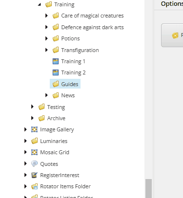
- Navigate to the folder where the image component needs to be created.
- Right click on the folder where you want the image component to live
- Select 'insert' and then 'Image'
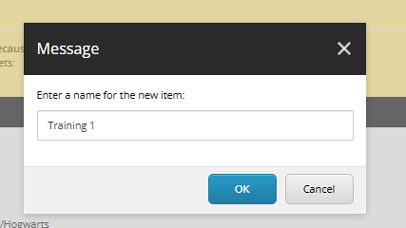
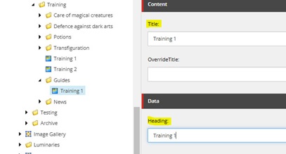
- Enter an appropriate name for the image component in the pop-up box.
- Enter an appropriate value in the 'Title' field. When you create the image component, the title field has a red error line against it. This error line will disappear once a value is added. If you are entering a 'Heading' value, it can be the same as this. Only the 'Heading' value will display when the component is added to a page; not the 'Title' value.
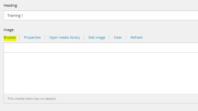
- Click the 'browse' button to add your image to the component. The image will already need to have been uploaded to the Media Library (or already live there). Learn more about image dimensions for components.
- When the 'Media items' window appears, select the 'tree view' option in the top right corner
- Open 'UoL', then 'Images' and then navigate through the 'Media Library' until you find your image
- Select the image and then click the 'Select' button in the bottom right corner of the window
- There is a search function, so if you know the name of the image, enter it here. Make sure to select the image to preview it in the right hand bar and make sure it is the correct image with the correct dimensions.
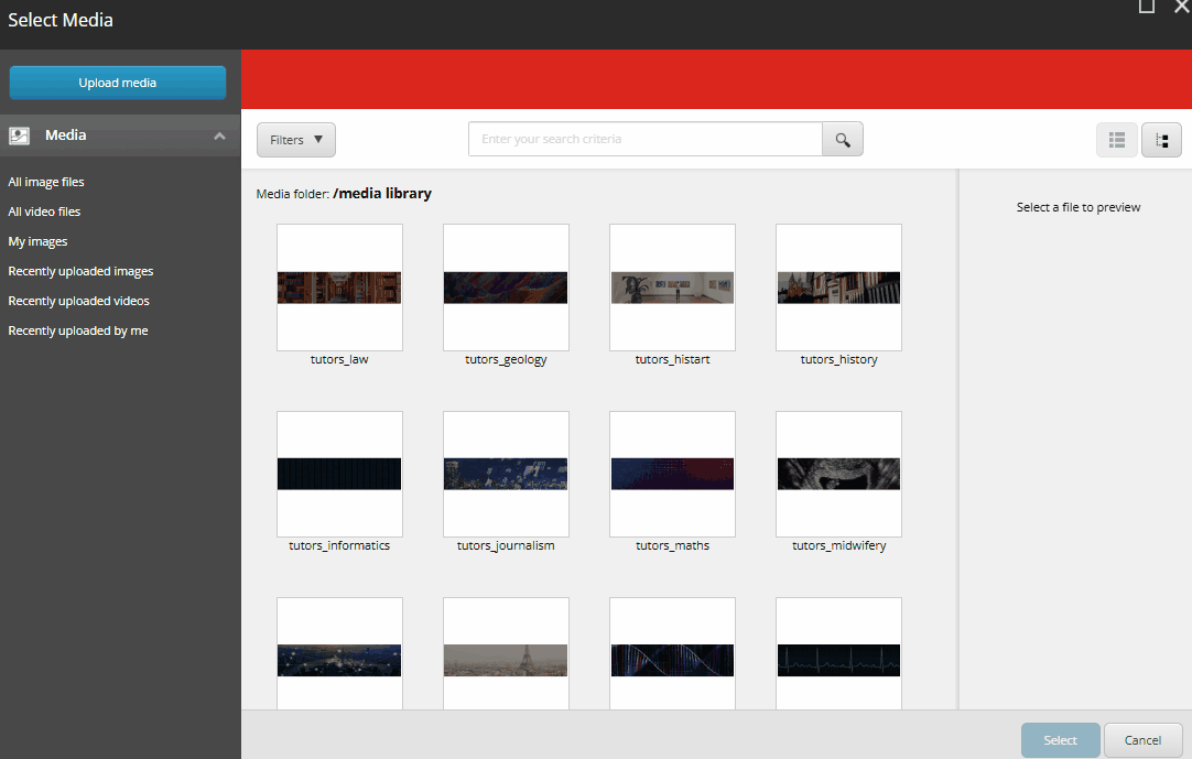
Image component content
It is up to you how you want to build the content for the image component. You may need it as a more dynamic way of presenting a link (often the main reason for an image component). Or it may be a way to structure multiple images on a page (which is not as easy to do when adding multiple images to the rich text editor).
The following guidance shows what you could do and is not necessarily a checklist for what you should do. For instance, you may wish to use a combination of the following for an image component:
- Heading, caption and link
- Heading and link
- Caption and link
- Heading and/or caption, no link
- Just an image: no heading, no caption, no link.
Experiment with the options and what fits your content best.
Image component heading
- If a value is added to the 'Heading' field, it will show on the image component as a 'Heading 3'.

Image component caption
- A caption can be included to provide more context for the image or for where the link (if used) points to. It is displayed beneath the 'Heading' (if used).
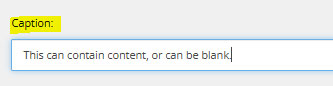
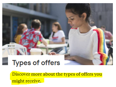
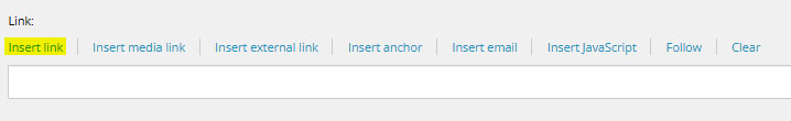
Image component link
- An image component can link to an internal link or an external link.
Internal link (a link which lives within the structure of le.ac.uk)
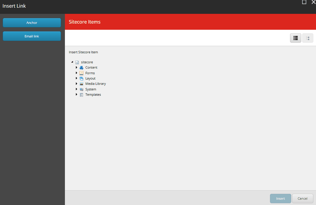
- Select 'internal link'
- Scroll through the content tree until you find your link. The link in the example is: le.ac.uk/library/information-hub. So, first 'Library' is opened and then 'Information Hub' is selected.
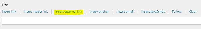
External link (a link which lives outside the structure of le.ac.uk)
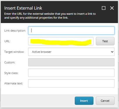
- Select 'insert external link'
- Enter the full URL into the 'URL' field
- Click 'Insert'
- Do not use URLs which begin with 'eur03.safelink'. Put these links into the address bar of your browser and click return. The page should load and show the direct link to the site in the address bar. Copy this and use instead.