Training guides
Component containers
In order to add a component to a page, you must first add a container for the component to sit within. This means the components will sit correctly on the page and be responsive according to the size of the screen.
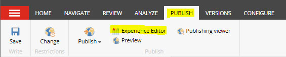
- Navigate to the 'publish' tab in the top toolbar
- Select 'Experience Editor' and a new page will open with an editable view of the front-end of the page.
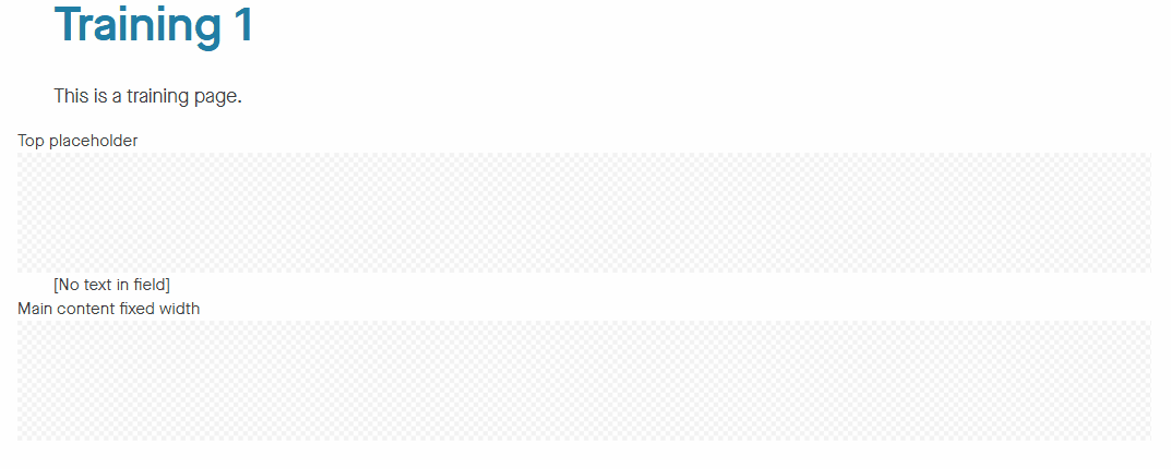
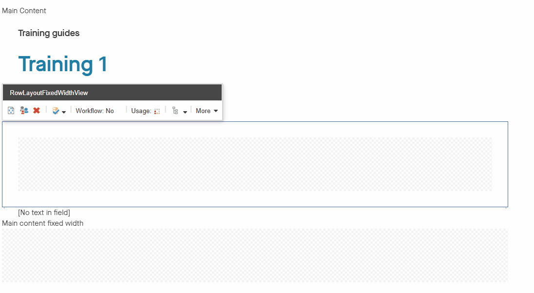
- Click within the grey box under 'top placeholder' and the option to 'add component' will appear. Click on this.
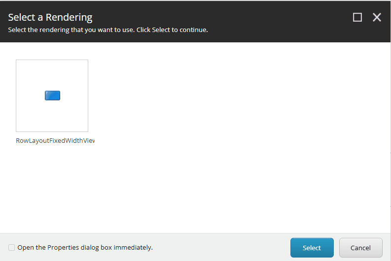
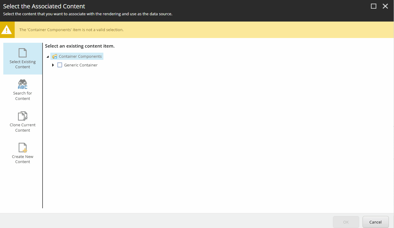
- Select the 'RowLayoutFixedWidthView' box
- Make sure the 'Open the properties dialog box immediately' is checked
- Click 'Select' in the right corner of the box.
One-column container
A one-column container will be the full-width of the page and would mostly likely be used for a video component, an accordion component, a large image component or a text box component.
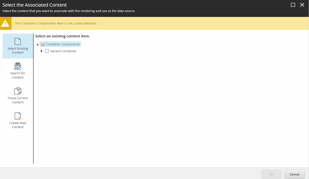
- Select 'Generic Container' and the select 'OK' in the bottom right corner of the screen.
- A control properties box will appear. Select 'One' from the 'Number of columns' field and click 'OK'
2-column container
A two-column container will create two containers side-by-side on the page. This is most likely used for image components, feature box components and a small-view video component.
- Select 'Generic Container' and the select 'OK' in the bottom right corner of the screen.
- A control properties box will appear. Select 'Two' from the 'Number of columns' field and click 'OK'
- Click within the grey box and the option to 'add component here' will appear. Click this option.
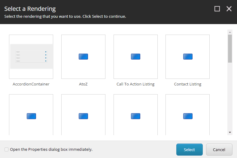
- A view of the components available to add to the page will appear. Select the appropriate option.
Find out more about how to add different types of components